Ventanilla, Peru
Bird of the Day: Blue-gray Tanager
Ventanilla, Peru
Ventanilla, Peru
Prospect Park, Brooklyn, NY
female – Baja California Sur, Mexico
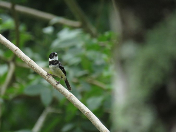
Parque del Acueducto, Cali, Colombia

Image © National Geographic
In 2016 I wrote a couple times about eBird’s data––the observations contributed by citizen scientists––being used for migration maps, among other things. Those posts included animated gif images that illustrated the flow of thousands of birds across the Western Hemisphere at different times of year, which could be used in a casual setting to predict when to go out looking for a target species one wants to see in the wild, or in a conservation setting to know what time of the year is best to enforce certain environmental regulations, like open hunting or hiking seasons in sensitive areas. The moving maps also served as a mesmerizing graphic to simply astound us with the magnitude of travel these birds are undertaking.
female – Chan Chich Lodge, Belize
male – Gallon Jug Estate, Belize

Baja California Sur, Mexico
juvenile – Parque del Acueducto, Cali, Colombia

Gallon Jug, Belize
Rio Celeste National Park, Costa Rica
Miraflores, Peru

Baja California Sur, Mexico

Baja California Sur, Mexico

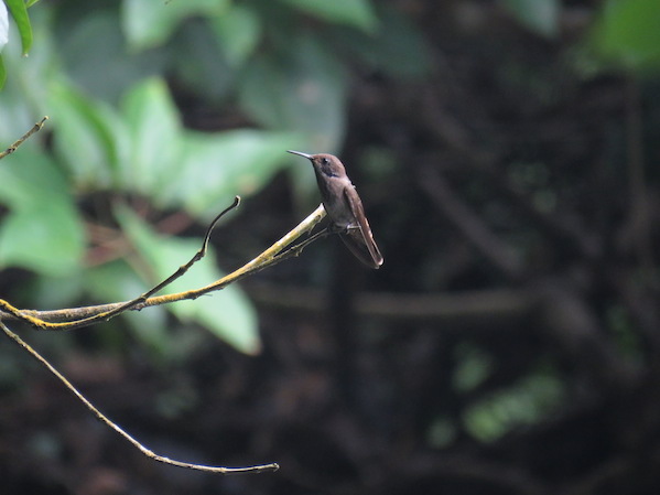
Estero San Jose, Baja California Sur, Mexico

Baja California Sur, Mexico

Gallon Jug Estate, Belize
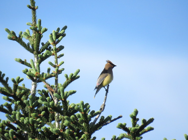
Mount Mitchell, North Carolina

Gallon Jug Estate, Belize

Atlanta, Georgia
