
The hues in the Forbes Collection include the esoteric, the expensive, and the toxic. Photograph by Jason Fulford for The New Yorker
Color is such a constant in our lives that it seems odd to consider any need for it’s conservation. How it exists in nature, how we humans perceive it, and how we’ve use the technology of the time to preserve it, has been relevant for tens of thousands of years. The Forbes Collection archives in the Harvard University’s Fogg Art Museum highlights the work of it’s founder, Edward Waldo Forbes, for whom “pigment hunting and gathering was not just a matter of creating an archive of lost or languishing color. It was about the union of art and science.”
Treasures from the Color Archive
The historic pigments in the Forbes Collection include the esoteric, the expensive, and the toxic
How blue can it get? How deep can it be? Some years ago, at the Guggenheim Bilbao, I thought I’d hit on the ultimate blue, displayed on the gallery floor. Yves Klein, who died at thirty-four, was obsessed with purging color of any external associations. Gestural abstraction, he felt, was clotted with sentimental extraneousness. But, in search of chromatic purity, Klein realized that even the purest pigments’ intensity dulled when combined with a binder such as oil, egg, or acrylic. In 1960, he commissioned a synthetic binder that would resist the absorption of light waves, delivering maximum reflectiveness. Until that day in Bilbao, I’d thought Klein a bit of a monomaniacal bore, but Klein International Blue, as he named the pigment—rolled out flat or pimpled, with saturated sponges embedded in the paint surface—turned my eyeballs inside out, rods and cones jiving with joy. This is it, I thought. It can’t get any bluer.
Until YInMn came along: the fortuitous product of an experiment in the materials chemistry lab at Oregon State University in 2009. Intending to discover something useful for the electronics industry, Mas Subramanian and his team heated together oxides of manganese, yttrium, and indium at two thousand degrees Fahrenheit. What emerged was a new inorganic pigment, one that absorbed red and green light waves, leaving as reflected light the bluest blue to date. Subramanian sent a sample to the Forbes Collection in the Straus Center for Conservation and Technical Studies, at Harvard University, where it sits with twenty-five hundred other specimens that document the history of our craving for color.
Among the other blues on the Forbes’s shelves is Egyptian Blue, a modern approximation of the first synthetic pigment, engineered five millennia ago, probably from the rare mineral cuprorivaite, a soft mid-blue used for the decoration of royal tomb sculpture and the wall paintings of temples. Later, blues strong enough to render sea and sky were made from weathered copper-carbonate azurite—crystalline bright but sometimes darkening in an oil binder. In 1271, Marco Polo saw lapis lazuli quarried from a mountain at Badakhshan, in what is now Afghanistan. Laboriously prepared by removing impure specks of glinting iron pyrite, it became ultramarine—as expensive, ounce for ounce, as gold, and so precious that it was initially reserved for depictions of the costume of the Virgin. In addition to these, the Forbes Collection has a poor man’s blue—smalt made from crushed cobalt containing potassium glass, which weakens, eventually, to a thin greeny-brown gray.
The Forbes Collection owes its existence to a belief in the interdependence of art and science, but it is also an exhaustive archive of cultural passion. A display features Vantablack, which absorbs 99.96 per cent of light, and has to be grown on surfaces as a crop of microscopic nanorods. In 2016, the sculptor Anish Kapoor saw the pigment’s potential for collapsing light, turning any surface into what appears to be a fathomless black hole, and he acquired the exclusive rights to it. An outcry from artists, who objected to the copyright, prompted the Massachusetts manufacturer NanoLab to release Singularity Black, created as part of the company’s ongoing research with nasa, to the public, and the artist Stuart Semple to make the World’s Pinkest Pink available to any online buyer willing to declare himself “not Anish Kapoor.” But Kapoor obtained a sample of the pink pigment, and used it to coat his middle digit, which he photographed and posted online for Semple.
Narayan Khandekar, the head of the Straus Center for Conservation and Technical Studies, takes pleasure in such skirmishes, secure in the knowledge that he presides over something weightier: a priceless resource for understanding how works of art are made, and how they should be preserved. The Department of Conservation and Technical Research was founded, in 1928, by Edward Waldo Forbes, the director of Harvard’s Fogg Museum from 1909 to 1944. Today, the Forbes’s vast library of color and its technical laboratories are housed in the museum’s steel-and-filtered-glass rebuild, designed by Renzo Piano. Rows of pigments in tubes, jars, and bowls are visible through the doors of floor-to-ceiling cabinets. Khandekar had the winning idea of displaying them as if unspooled from a color wheel: reds at one end, blues at the other. There are the products of nineteenth-century chemical innovation—viridian green, cadmium orange, and the chrome yellow with which van Gogh was infatuated but which, over time, has begun to darken his sunflowers. But at the heart of the Forbes Collection are the natural pigments that were the staples of painters’ inventories before chemically synthesized paints replaced the impossibly esoteric, the dangerously toxic, the prohibitively expensive, and the perilously fugitive. Continue reading

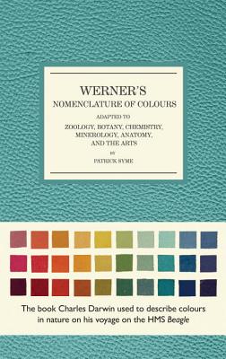
 Darwin, then twenty-three, was only three months into the nearly five-year adventure that would transform his life and, eventually, the way that humans saw themselves and other species. As the voyage’s so-called scientific person, he would collect masses of rocks, fossils, animals, and plants, periodically shipping his specimens to Cambridge in containers ranging from barrels to pillboxes. Like other naturalists of his time, though, his primary documentary tool was
 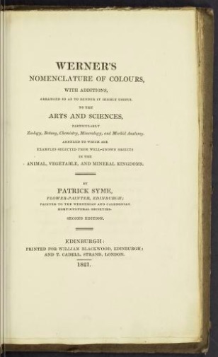 Syme’s guide, a facsimile of which will be released in early February by Smithsonian Books, contains samples, names, and descriptions of a hundred and ten colors, ranging from Snow White to Asparagus Green to Arterial Blood Red to, finally, Blackish Brown. Based on a color-naming system developed in the late eighteenth century by the German mineralogist Abraham Werner, the guide is full of geological comparisons: Grayish White is likened to granular limestone, Brownish Orange to Brazilian topaz. Syme, a flower painter and art teacher, added comparisons from the living world. To Werner’s eyes, the Berlin Blue that Darwin saw in the Atlantic sky resembled a sapphire; to Syme, the wing feathers of a jay.

