Deniers, we already know you will find a way to see this from some other perspective, and we have given up trying to understand why you do that. But for everyone else, there is still time to understand the implications of this science. And there is no shame in using props to help learn. Thanks to Brad Plumer and Nadja Popovich for making sure we get the point, with clear graphical illustration, about what this recent study is saying and why every one of us should care:
Why Half a Degree of
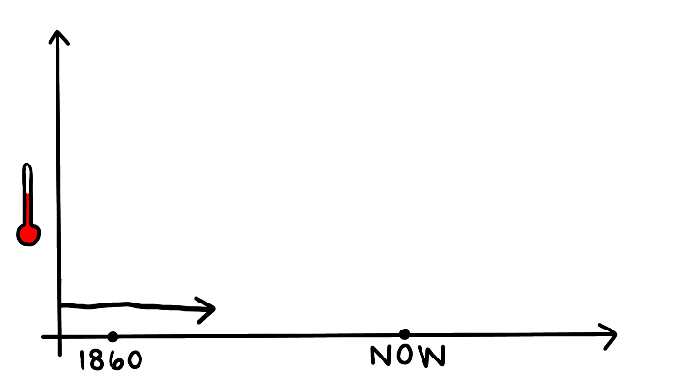
Global Warming Is a Big DealThe Earth has already warmed 1 degree Celsius (1.8 degrees Fahrenheit) since the 19th century. Now, a major new United Nations report has looked at the consequences of jumping to 1.5 or 2 degrees Celsius.
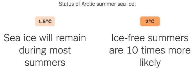
Half a degree may not sound like much. But as the report details, even that much warming could expose tens of millions more people worldwide to life-threatening heat waves, water shortages and coastal flooding. Half a degree may mean the difference between a world with coral reefs and Arctic summer sea ice and a world without them.

An additional half-degree of warming could mean greater habitat losses for polar bears, whales, seals and sea birds. But warming temperatures could benefit Arctic fisheries.


Extreme heat will be much more common worldwide under 2°C of warming compared to 1.5°C, with the tropics experiencing the biggest increase in the number of “highly unusual” hot days.
Read the rest of this graphics-rich story here.
